São Paulo, Brazil
Local time, --:--Your time, --:--
About Project
Perfect with Orange
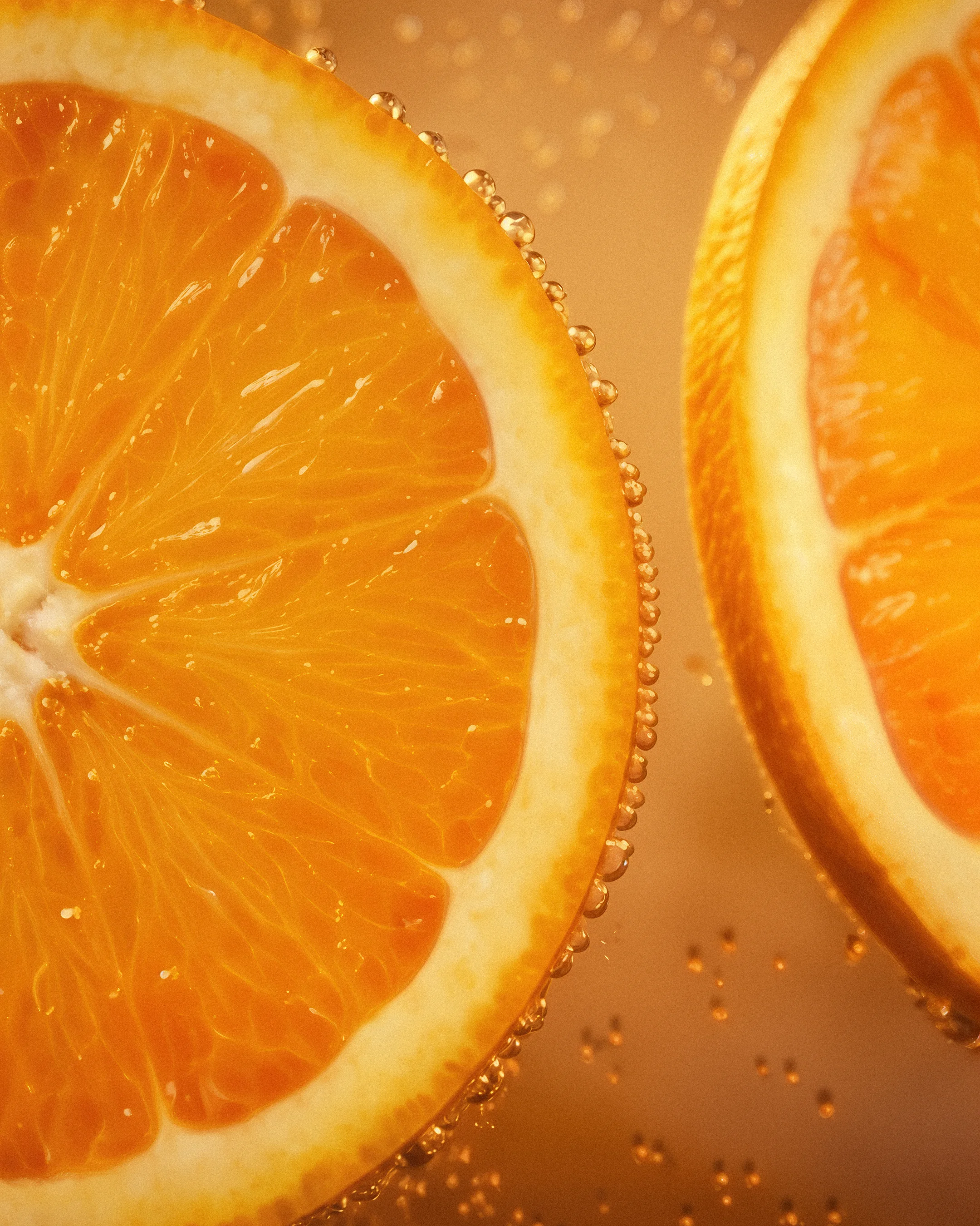
Blue Moon’s renewed visual identity was created to strengthen the brand’s presence, reinforcing one of its most recognizable truths: Blue Moon is perfect with orange. The result is a visual language that reinforces Blue Moon’s connection to its recipe, its perfect serve and its presence across retail environments, making the orange feel as essential to the brand as the beer itself.
[Details]
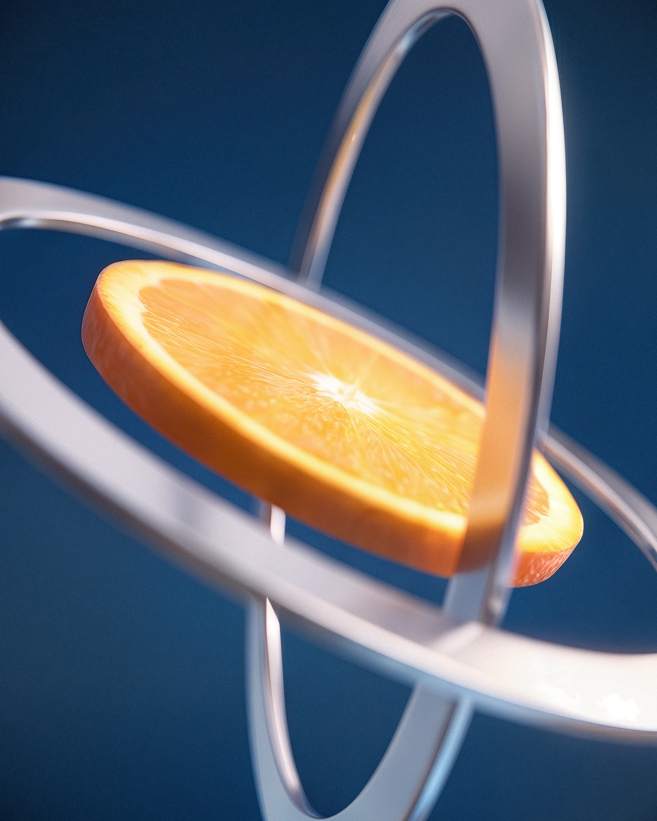
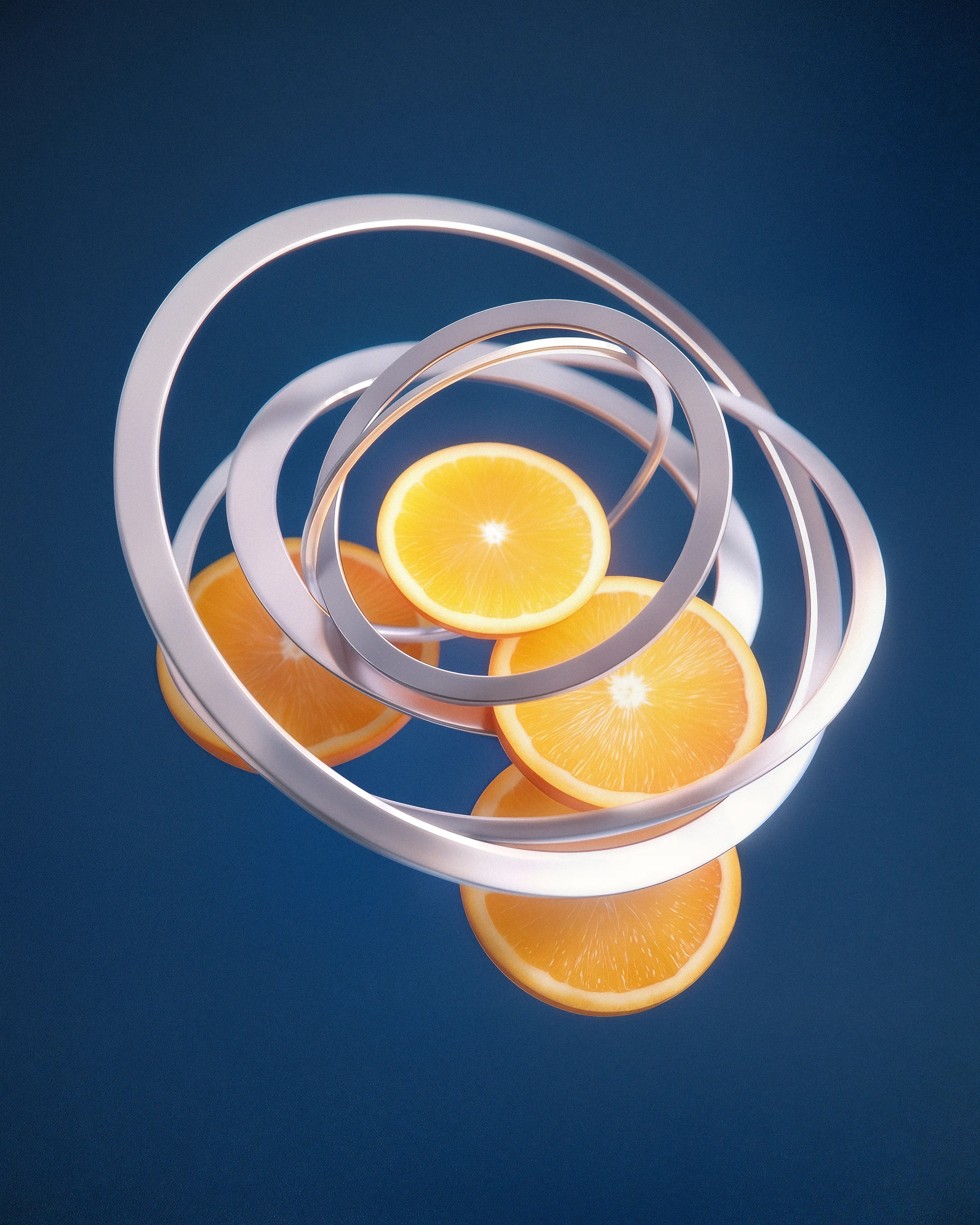
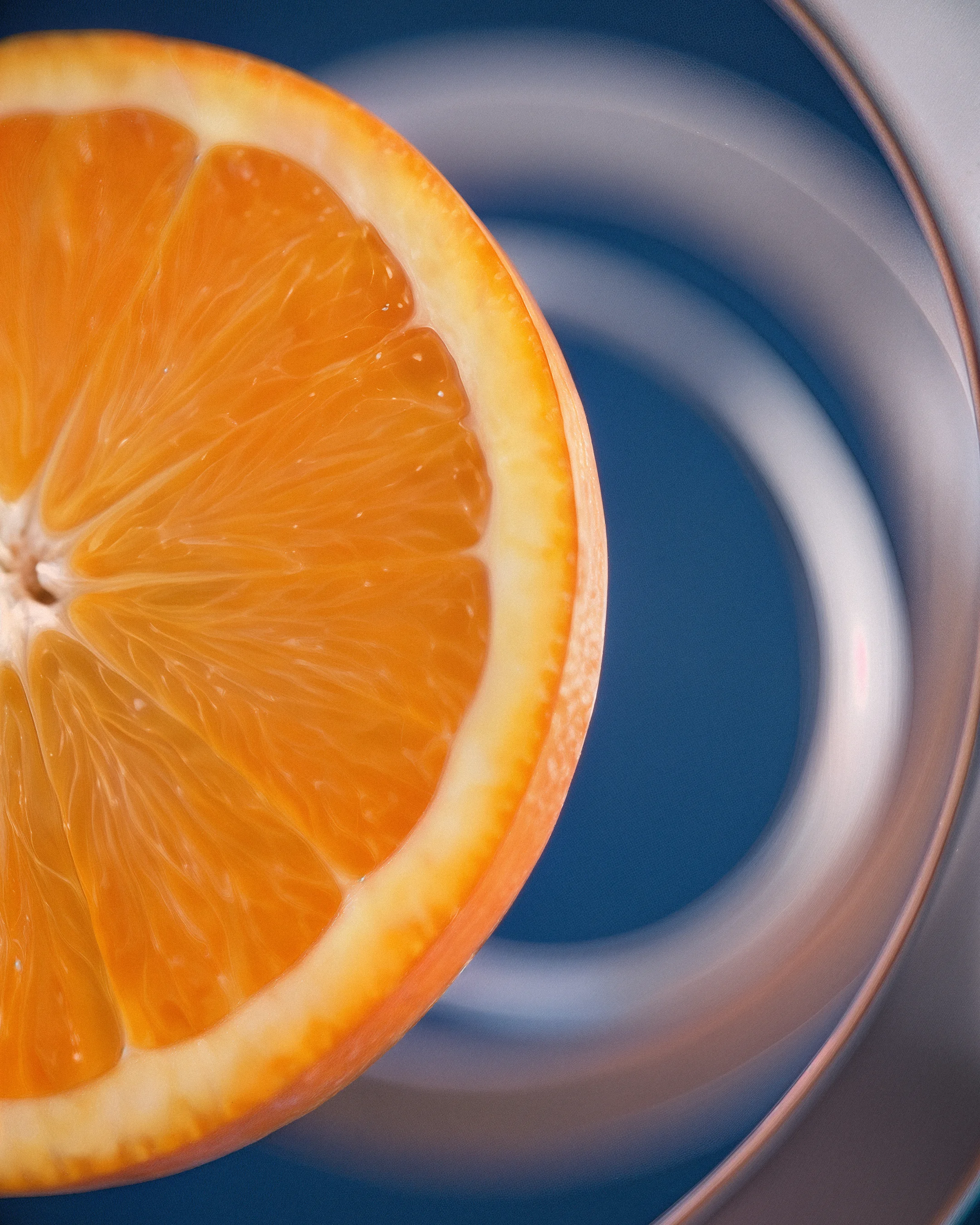
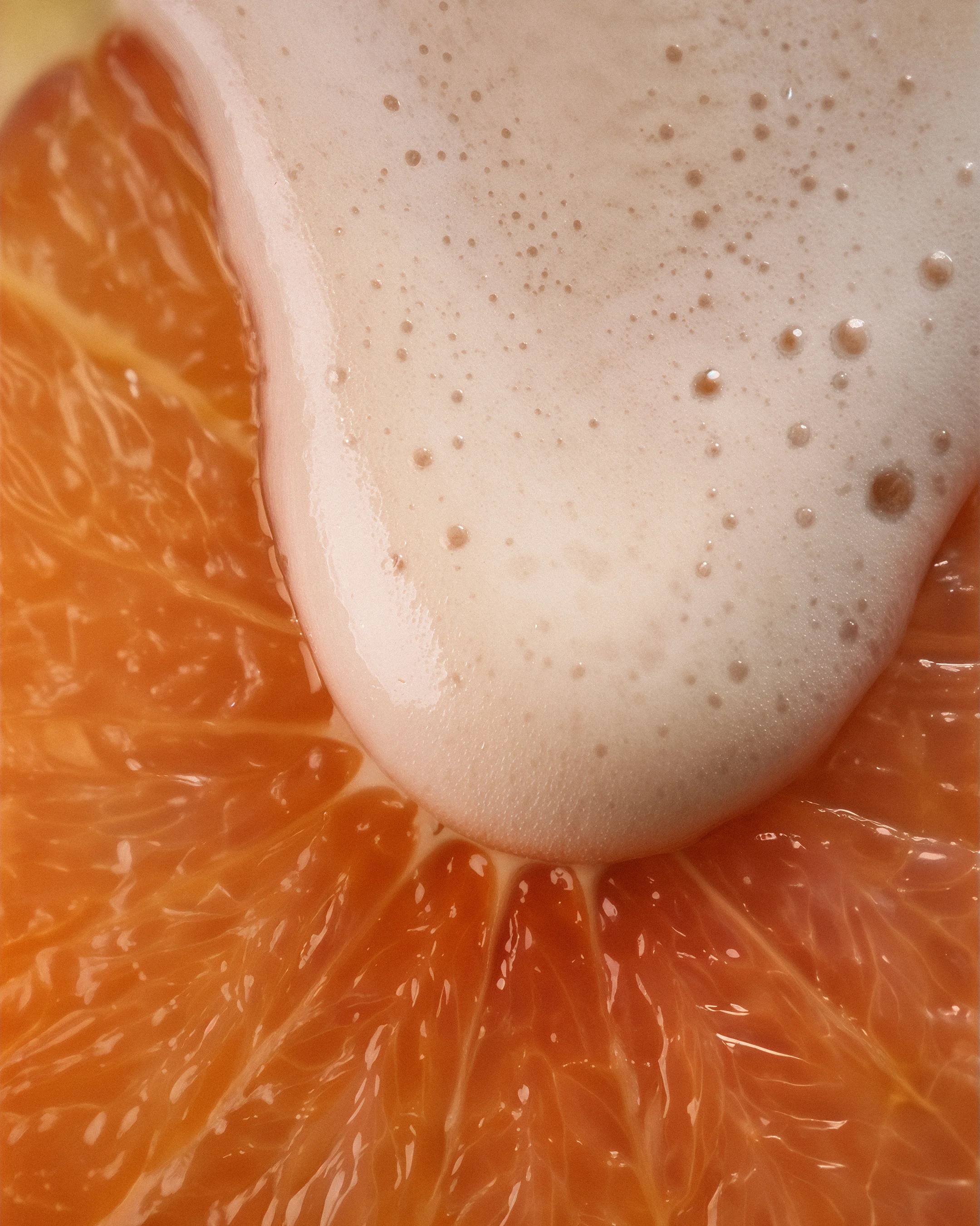
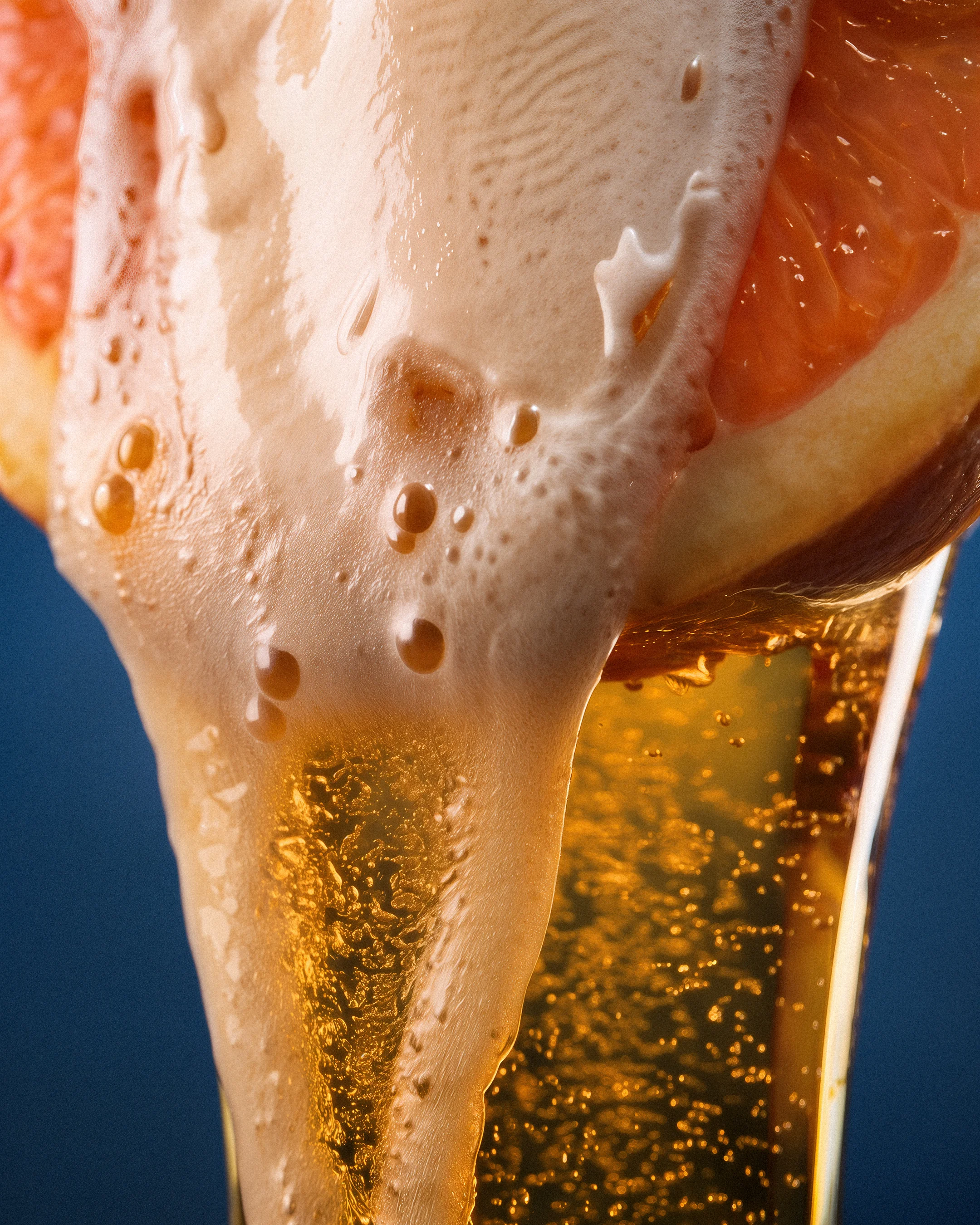
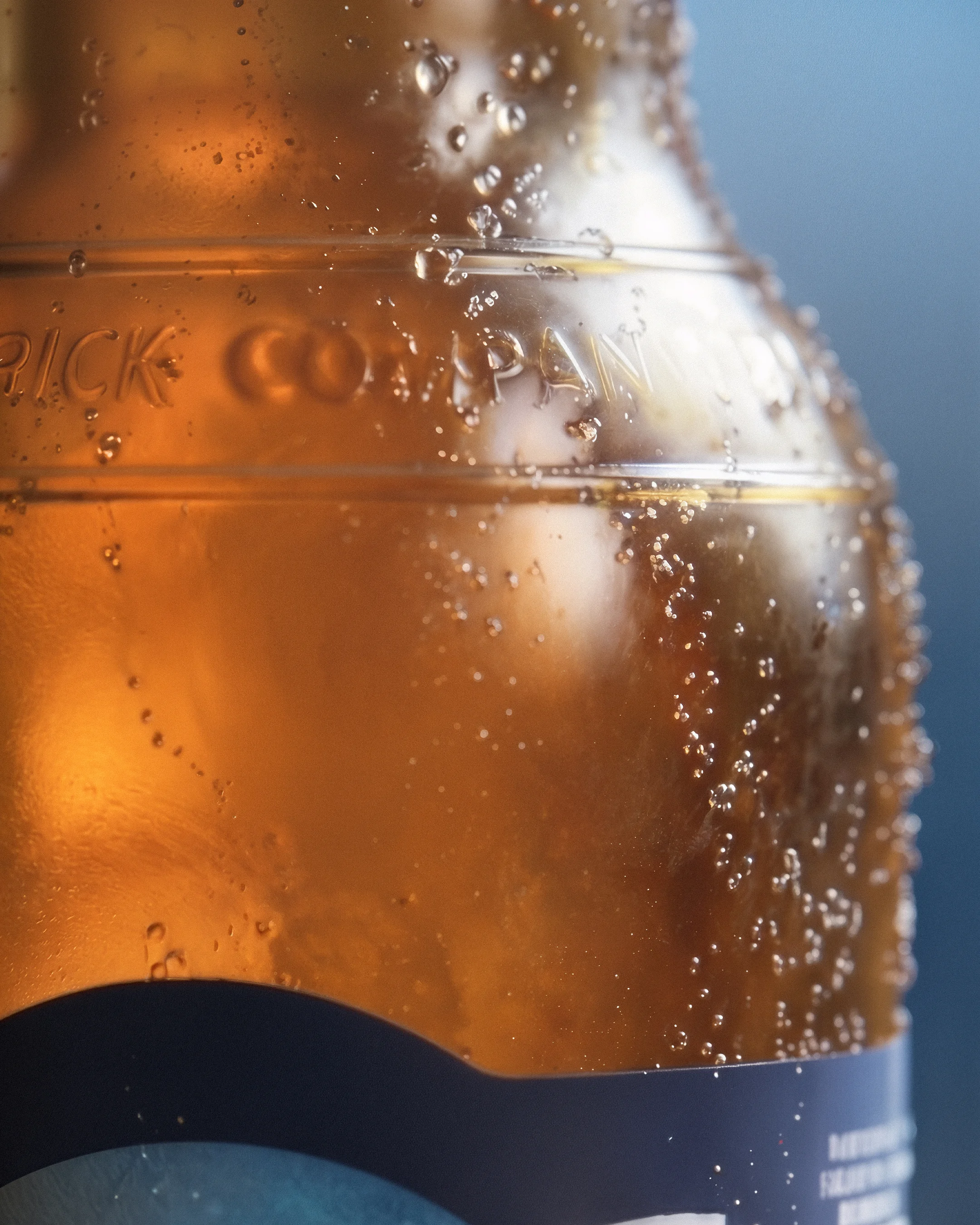
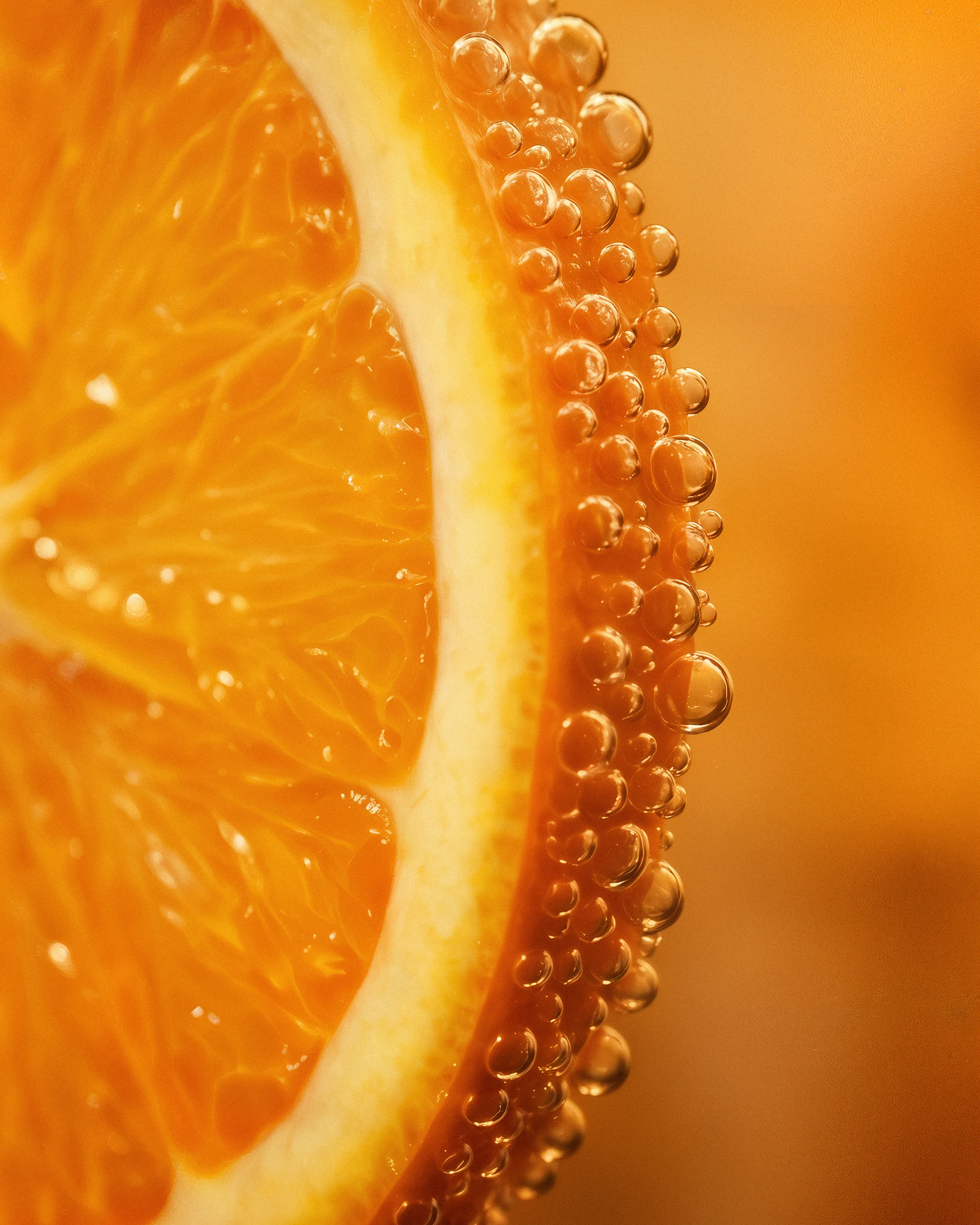
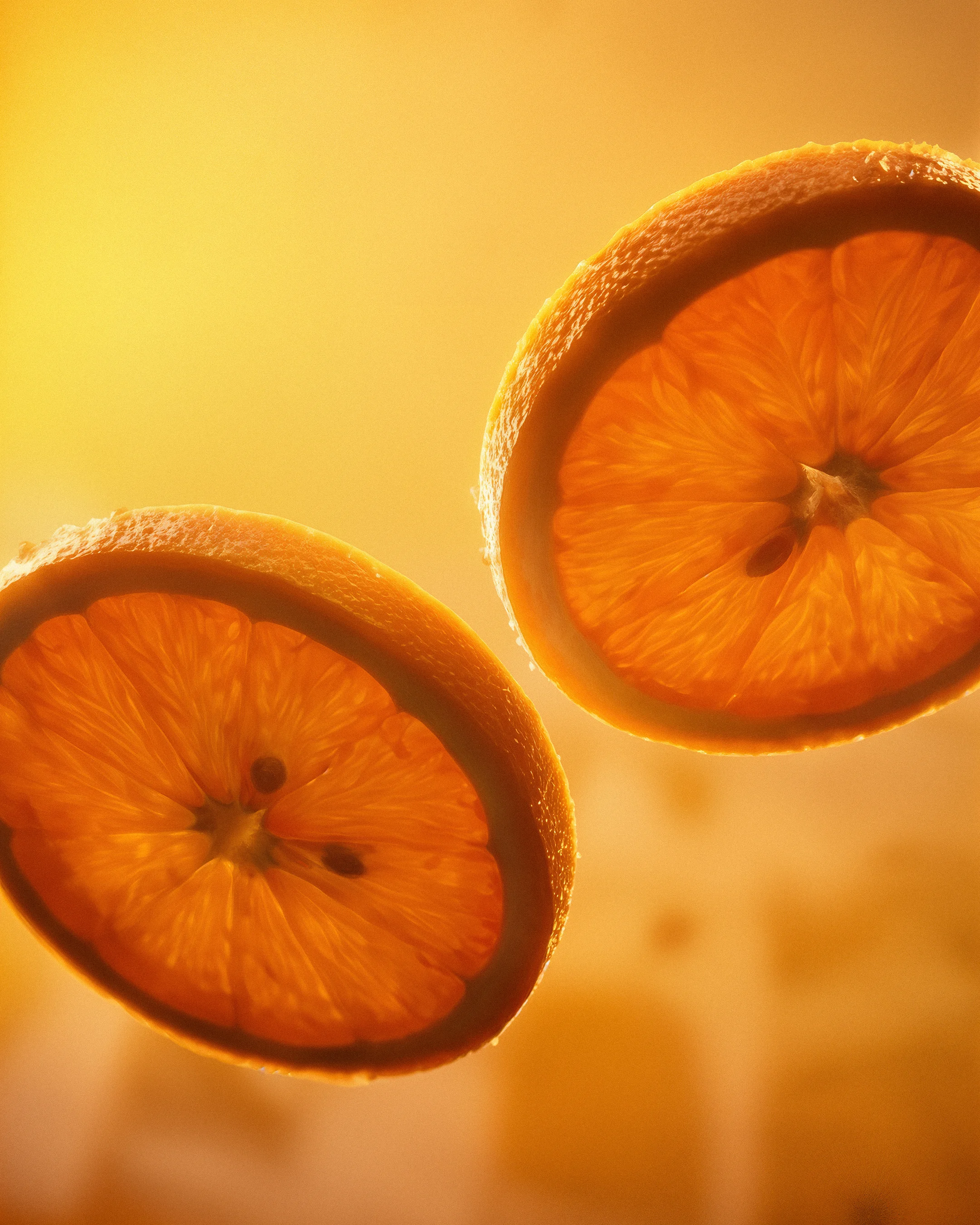
For this campaign, we developed a series of 3D assets designed to expand that idea visually. The work explored the orange not only as an ingredient and serving ritual, but as a central brand element a symbol capable of adding freshness, depth and recognition to the visual system.
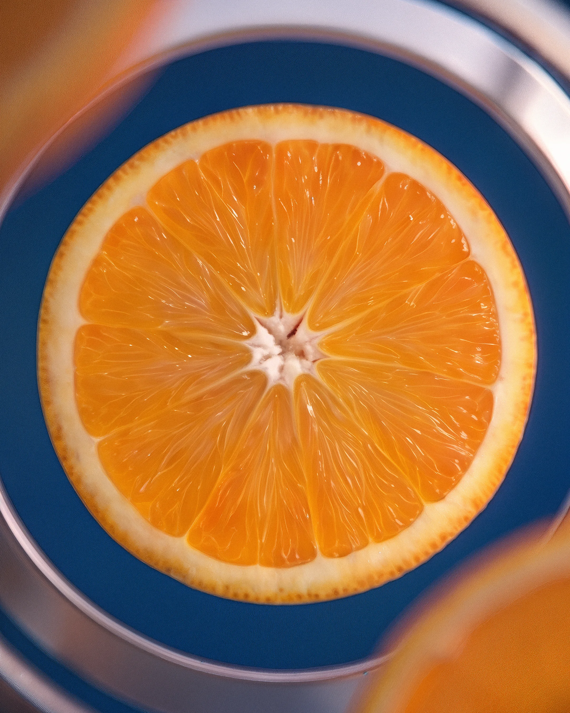
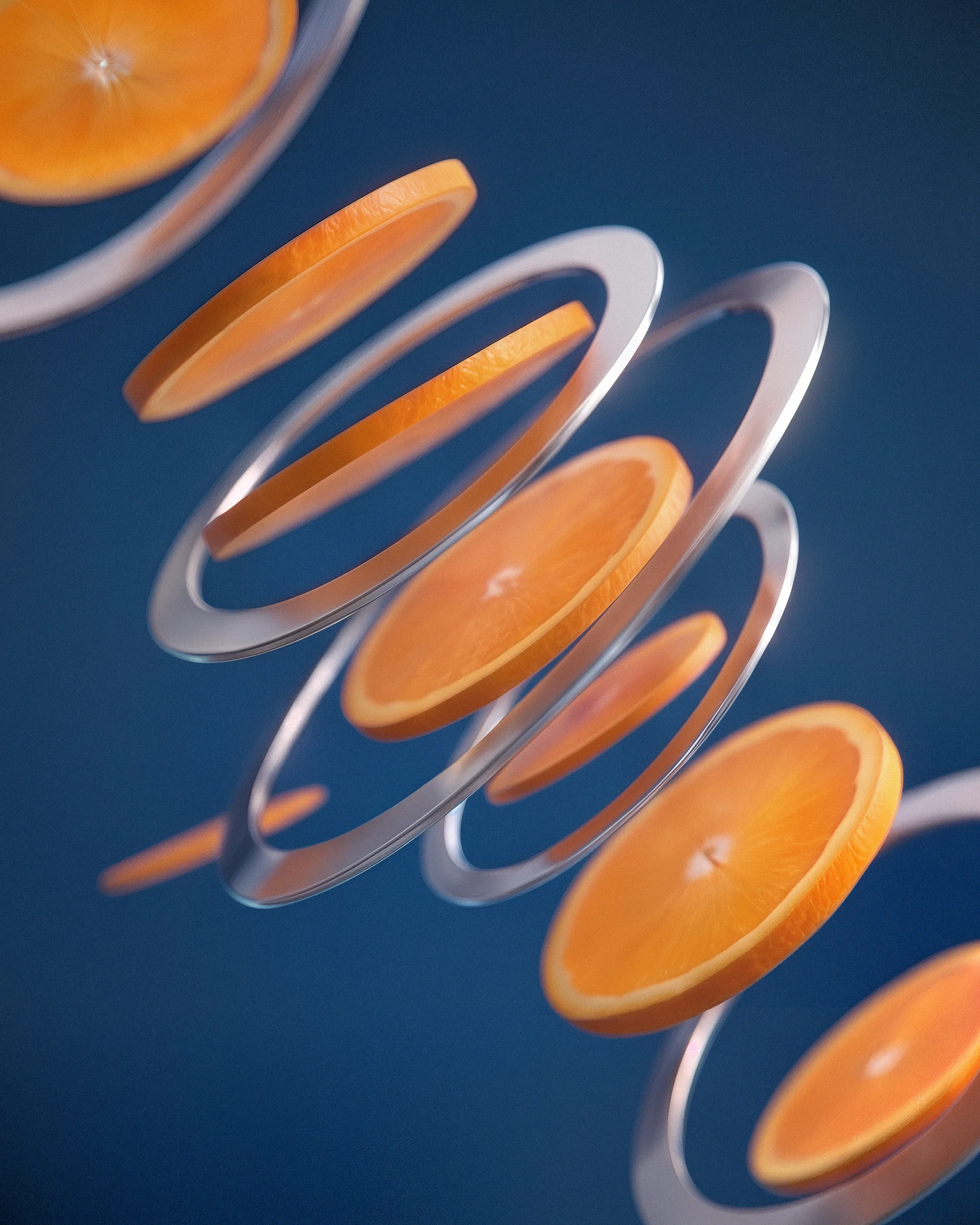
Through detailed 3D compositions, textures and product-driven imagery, we helped translate the new identity into campaign assets that highlight the elements that make Blue Moon iconic: the centered logo, the bright moon, the classic typography and the Valencia orange slice now brought into the label.